
Summer 2026 is likely the hottest summer on record since 1895. The NYT editorial board describes the warming days and warns of what is to come.
In many parts of the country, extreme heat affects much more of the year than it once did. In the late 1980s and early 1990s, Fulton County, Ga., which includes Atlanta, spent about 47 days a year with a heat index (a measure that combines temperature and humidity to estimate how hot it feels) exceeding 90 degrees. In recent years, Fulton County’s residents have typically endured 79 such days, an increase of a month.
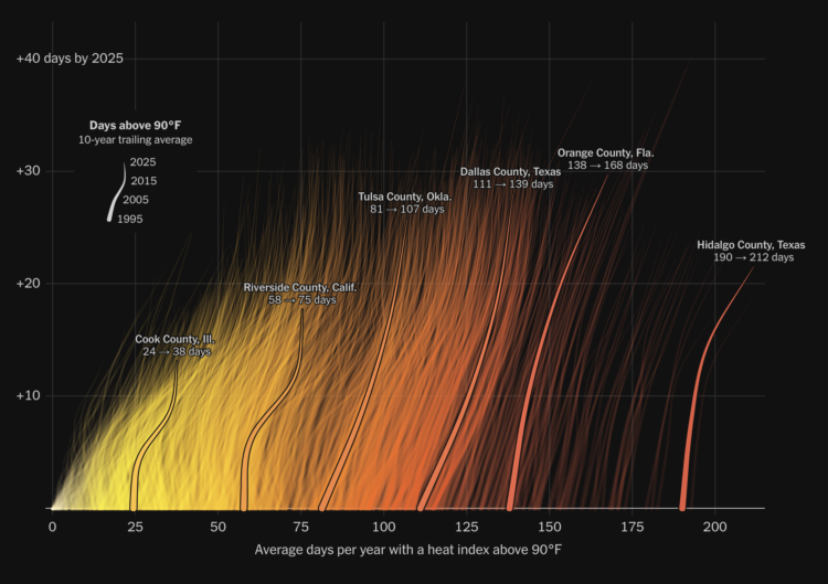
There are several charts and maps by graphics editor Gus Wezerek. The introduction chart, shown above, looks like radiant lines rising off a hot surface.
It’s a clever use of a connected scatterplot. The x-axis is the average days per year with a heat index above 90 degrees Fahrenheit, using a 10-year moving average. The y-axis is the difference between points in time. Points are connected from 1995 through 2025.
Tags: climate change, heat, New York Times