
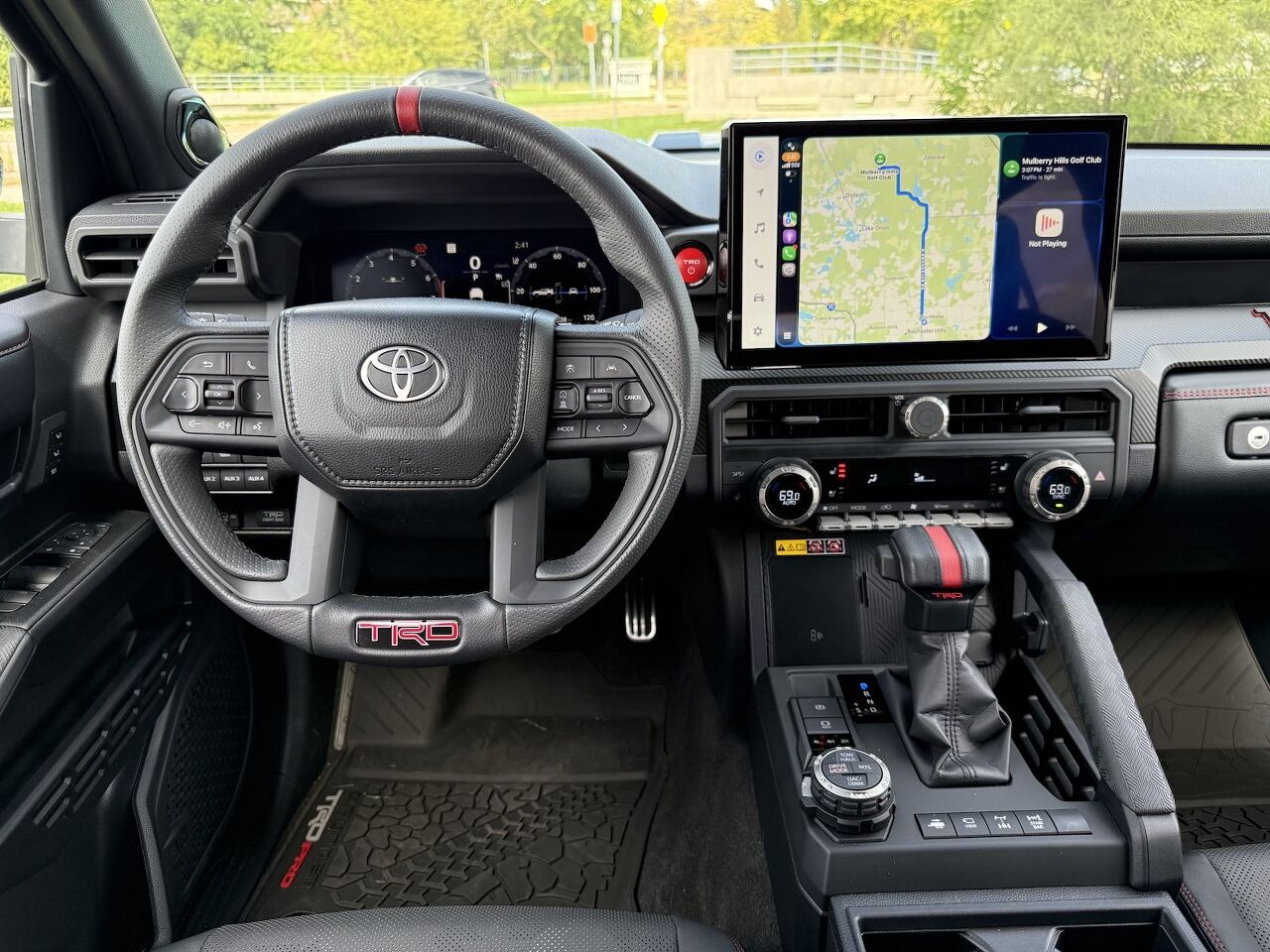
The switchless dashboard was always a cost decision dressed up as progress, and the industry is now walking it back without saying so out loud. As of 2025, major car manufacturers that once stripped out physical controls are bolting buttons and knobs back onto their interiors, and not one of them has stood up to admit the original approach was a mistake. The new dashboard designs say it for them.
What changed is not taste. It is the realization that minimalism carries a liability. Automakers putting controls back have concluded that a clean look is not worth compromising safety, and the math is blunt: a single distracted-driving lawsuit is reckoned to cost more than the price of adding physical buttons. Below is how the industry talked itself into switchless cabins, why that failed drivers, and what the interior looks like now that the correction is underway.
The honest answer is money and manufacturing. Replacing a cluster of physical buttons with one touchscreen cut part count, assembly complexity, and production cost. One screen could stand in for a whole bank of individual controls, which meant fewer unique pieces to tool up for each model. Touchscreens also opened the door to over-the-air software updates, letting manufacturers change a car's behavior without redesigning any hardware.
Hiren Patel, senior design manager at Nissan, puts the design thinking plainly: the piano-black, switchless trend took hold because designers, companies, and engineers believed they could delete physical switches and push every control into software. The pitch had three parts, Patel recently told Ars Technica: save money, skip the tooling for car-specific parts, and make the cabin feel like a software experience rather than a machine.
There was a status angle too. In the early 2010s, Tesla reset expectations for the car cabin by going all-in on a large touchscreen, and from there, the minimalist touchscreen dashboard became shorthand for innovation in electric vehicles. Screens turned into status symbols and design differentiators, a way to signal that a brand was modern. It helped that stripped-down interiors with few switches photographed well and sold well on the dealership floor.
They were worse to use, and measurably so. A physical button lets you operate a control through muscle memory without looking away from the road. A touchscreen does not. It demands a sequence of look, find, tap, confirm, and correct your mistakes, where a knob is a single action. Touchscreens force the driver to look away, which raises cognitive load and slows reaction time, and the penalty is not trivial: studies show touchscreen use can slow a driver's reaction time by as much as 57 percent.
The daily annoyances piled up. Some touchscreen-only setups require three taps just to lower the air conditioning. Others bury seat-heater controls inside submenus. And because the screen is running live, some of these interfaces lag while the car is moving, which is exactly when you least want to wait on a menu.
Patel saw the complaints roll in. Many people told him that switchless cabins forced them to glance away from the road just to change the temperature, adjust the seat, or handle other basic tasks. He also punctures the obvious counterargument. People use touchscreen phones all day, so why not a car screen? Because, as Patel points out, operating in-car menus is not as easy or intuitive as using a phone. The deeper problem is structural: a modern car has multiple subsystems that all need controlling, and Patel notes that navigating those menus means wading through layer after layer, with every company doing it differently, a sign that nobody has landed on a truly good solution.
The uncomfortable summary is that some of these interior trends were plainly worse control schemes that raised driver distraction, and spread across the industry anyway.
Frame the reversal correctly. The return of physical buttons is a matter of ergonomics, not nostalgia. Buttons survived in cars because they match how humans naturally interact with a machine, not because of tradition. You can find a knob by feel; you cannot find a menu by feel.
Regulation gave the correction teeth. Europe's independent safety authority now requires physical controls for critical functions as a condition of a five-star safety rating, and the rule bans touch-only shortcuts and buried menus for those functions. Because automakers build for global markets, that single requirement pushed the whole industry to rethink touchscreen-only designs, not just the cars sold in Europe.
Vehicle interior design cycles through trends the same way home interiors do, and even a strong idea goes stale through overuse. The consumer and public pushback against switchless cabins is working.
Nobody is arguing the screen should disappear. The sensible split is by urgency. Controls you reach for while the car is in motion suit physical buttons, while touchscreens are being repositioned for non-urgent, stationary tasks like setting up navigation, browsing media, and configuring settings. You park, then you fiddle with the screen. You drive, then you want a knob under your hand.
The gauge cluster is changing too. The old analog dials are being replaced by heads-up displays, large infotainment screens, and augmented reality, and AR interfaces can project directions and live information into a driver's line of sight, which keeps the eyes forward rather than down. Voice and intelligence fill gaps the hardware cannot. Voice recognition handles spoken commands for navigation, calls, and climate with no need to touch anything, and AI-driven infotainment can learn a driver's preferences, suggest routes, and recommend entertainment.
With the control-layout fight mostly settled, the interior is where automakers now compete. The cabin is where brands fight it out now, and for plenty of shoppers it decides the purchase. A car can have strong performance numbers and still lose shoppers if the cabin is not modern and inviting.
Personalization is a big part of that. Automakers are offering customizable seats, lighting themes, and modular layouts so drivers can shape the space to their needs, with families leaning toward durable materials and luxury buyers toward premium leather and detailed stitching. SUVs and family vehicles are expected to offer adaptable layouts that flex from road trips to cargo hauling, which is where flexible, well-planned storage earns its keep.
Comfort features are migrating in from the luxury tier: seats that heat and cool, cabins that scrub their own air, and supportive seats that hold your posture, along with seat massage functions, stress-reducing ambient lighting, and sound systems tuned for relaxation. Materials are shifting too, as manufacturers move away from traditional plastics toward recycled, plant-based, and bio-composite options, including textiles spun from recycled bottles or bamboo fiber.
When you evaluate an interior, treat the control scheme as a safety feature, not a styling choice. Confirm that the functions you use while moving, climate, volume, seat heat, hazard lights, live on physical buttons or knobs you can find by feel, and that the touchscreen is reserved for the setup tasks you handle while parked.
Check whether the car carries a five-star safety rating under a regime that demands physical controls, since that rules out the worst buried-menu offenders. Then weigh the softer factors, storage, seat comfort, and material durability, against how you actually use the vehicle. The industry has quietly admitted that buttons work. Your job is to make sure the car in your driveway got the memo.
[Images: ]
Become a TTAC insider. Get the latest news, features, TTAC takes, and everything else that gets to the truth about cars first by subscribing to our newsletter.